


Praise Brand Kit
Everything you need to represent Praise consistently — our story, voice, colors, type, logos, and imagery. Please keep our look and message intact, and reach out before publishing anything you're unsure about.
Everything you need to represent Praise consistently — our story, voice, colors, type, logos, and imagery. Please keep our look and message intact, and reach out before publishing anything you're unsure about.
Grab everything in one zip — logos, graphic elements, and approved photography. Or download individual files in the sections below.
Bundles every file linked on this page into one zip.
Four principles that guide every product, post, and partnership.
Rooted in faith, made with a clear conscience.
No artificial colors, naturally sweetened, real ingredients.
Energy and hydration for focus, training, and everyday life.
We show up with positivity — even prayer requests live right on the can.
Praise is a faith-forward brand creating clean energy drinks and hydration electrolytes — built to support focus, performance, and everyday life, rooted in faith. We make products people can feel good about, with a clear conscience and a clear purpose.
Vision: a brand that fuels body and spirit. Values: faith, integrity, quality, and community.
Primary tagline: Fuel your day. Honor your soul.
Hydration line: Hydrate. Replenish. Recover.
Alternates: Energy for the body, fuel for the soul. · Clean energy, higher purpose.
Click any value to copy. On the web: white is the background, cyan breaks up sections, black is text, gold accents. On packaging: cyan is the background and white is the text. Lime green and fruit punch red are flavor accents — confirm exact values against the final cans.
The Praise type system is the Eurostile family (Adobe Fonts). Eurostile Heavy Condensed leads for titles & headings; Eurostile (regular) carries body & UI; Eurostile Extended is reserved for the wordmark.
Three lockups, each available as SVG and PNG: Praise Energy, Praise Hydration, and the Praise wordmark.
Clear space: keep padding around the logo at least the height of the P in PRAISE. Minimum size: about 24px tall on screen.
Please don't: recolor, stretch or squash, rotate, add shadows or outlines, or place on busy / low-contrast backgrounds.
The recurring brand elements: the signature cyan gradient and the product icons.
Zion in his signature poses — transparent PNGs, ready to drop into designs.
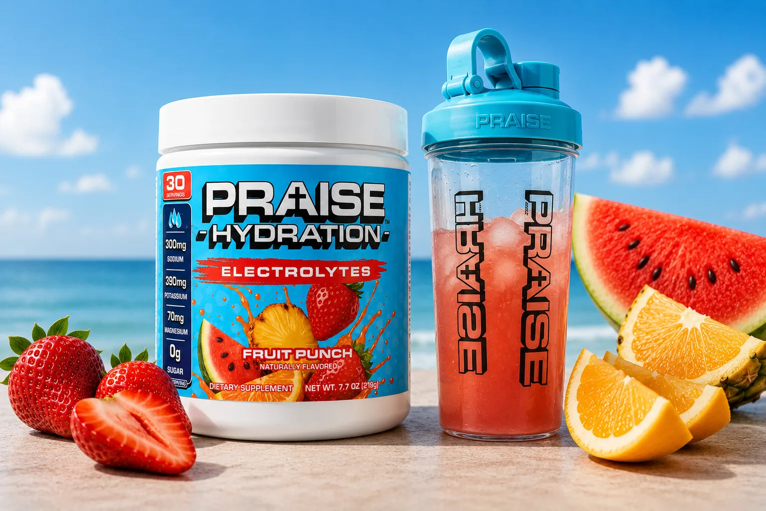
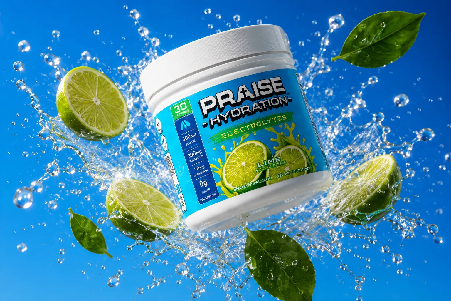
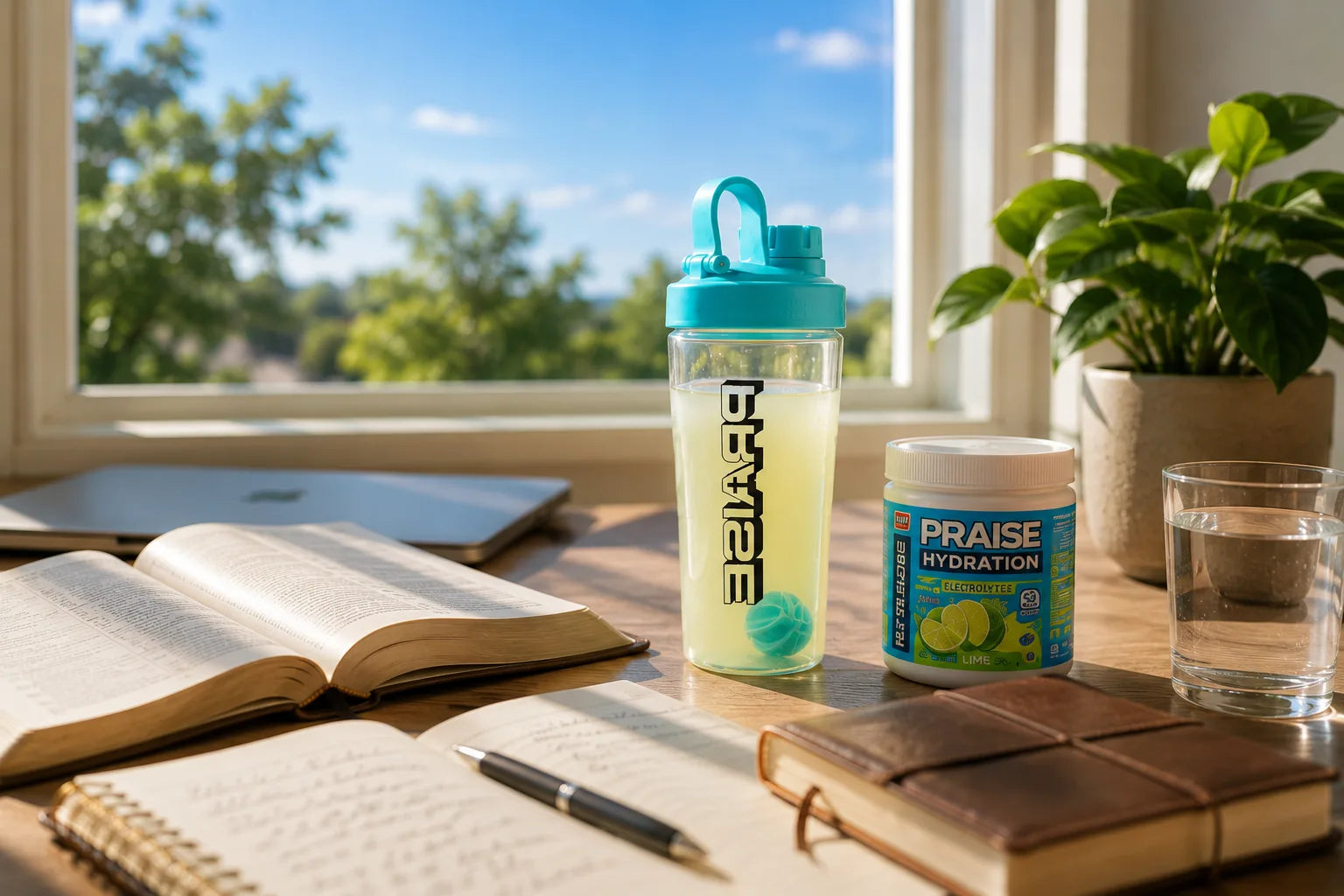
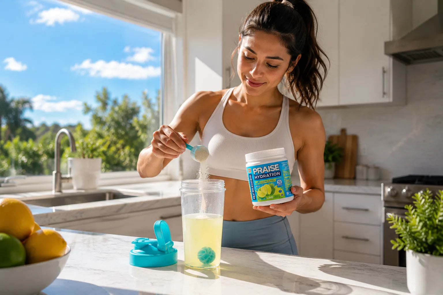
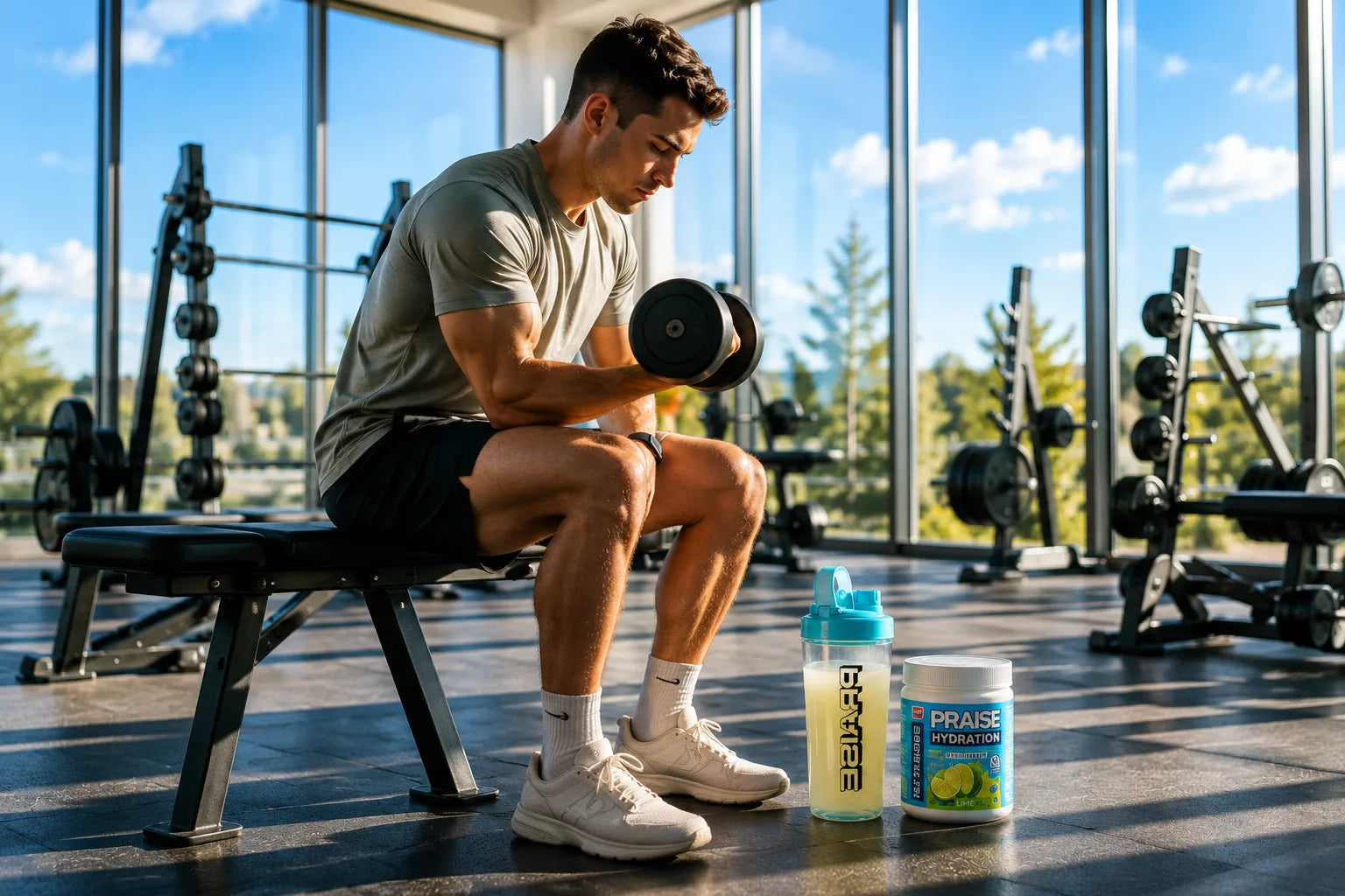
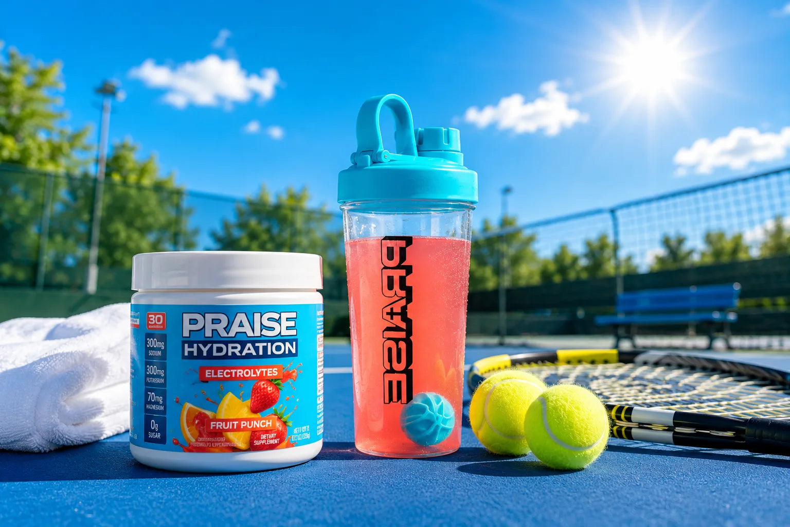
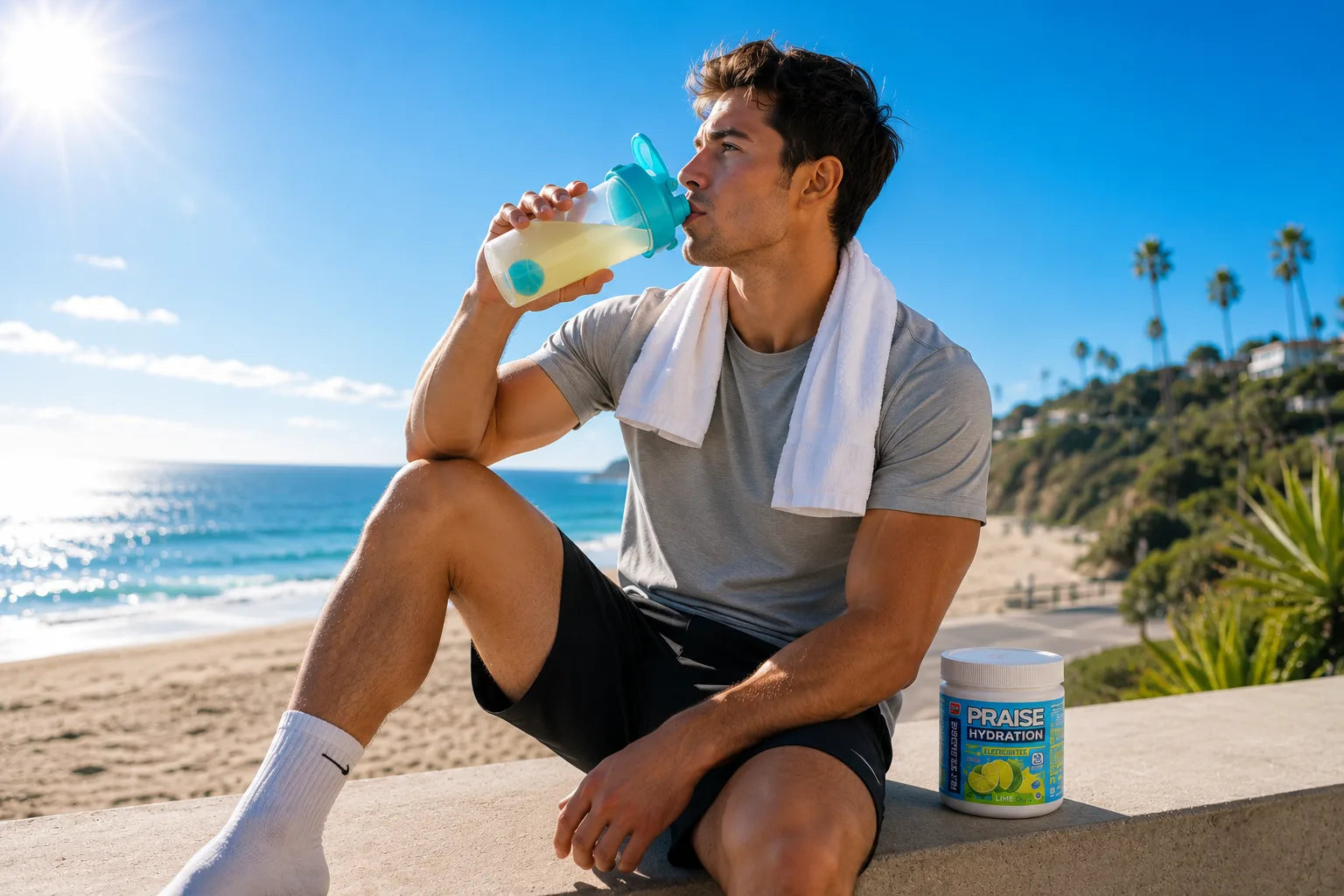
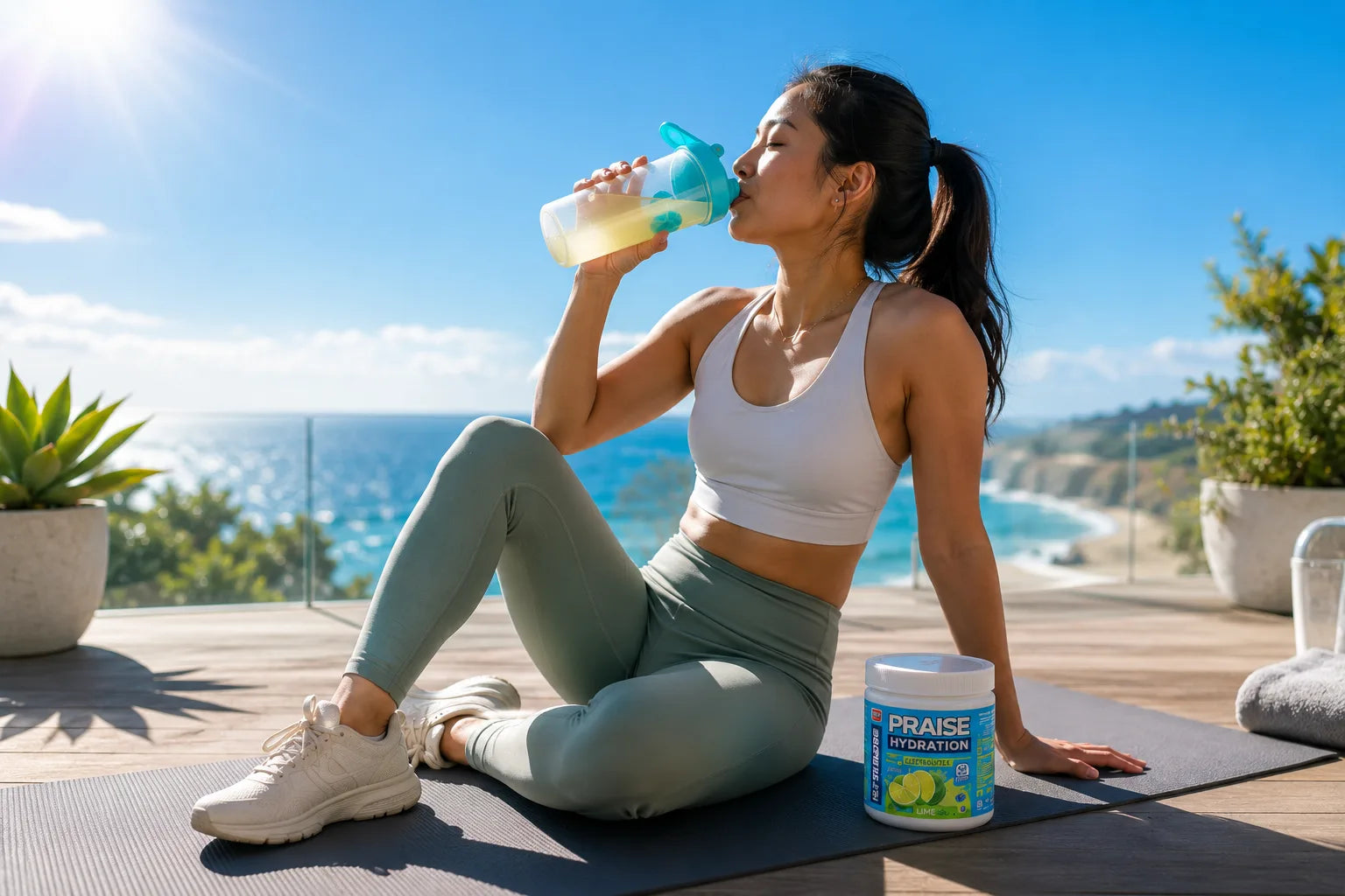
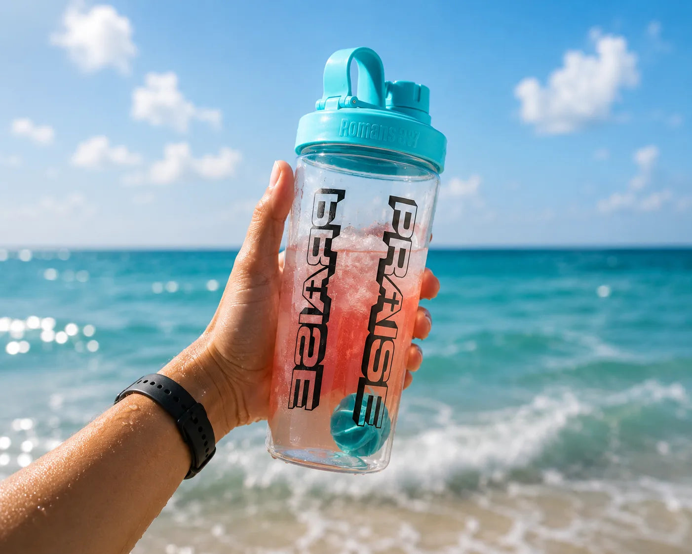
"If summer had a purpose." Praise photography is optimistic, energetic, modern, and bright — fuel for the life you're called to live, not a gym supplement. Think blue skies, sunlight, fresh fruit, crisp whites, and tropical water. Not louder, not tougher — just brighter.
Look: natural light (golden morning, midday sun, open shade), commercial / Apple-level cleanliness, strong negative space, vibrant true color. People: real and relatable, ages 20–35, neutral and earth-tone wardrobe, no big logos — never influencers or fitness models. Scenes: kitchen, boutique gym, beach, running trail, community hangouts; recovery moments over hard action. Product: floating, fresh, premium — bright gradients, minimal fruit, water droplets, lots of breathing room. Editing: high contrast, bright whites, clean blues, natural skin, fresh greens.
Reference frames — match the direction above.

Encouraging, energetic, and genuine — never preachy or hype-y. We speak with warmth and confidence: faith-forward, positive, and down-to-earth. Short, punchy lines for headlines; clear and friendly for body copy.
Praise Brand Kit · v1.0 · 2026. Need something not here, or have a question about usage? Get in touch and we'll help.
Praise Energy, LLC · Loveland, OH. Trademarks: Praise Hydration, Praise Energy, Zion the Lion.

Your cart is currently empty.


